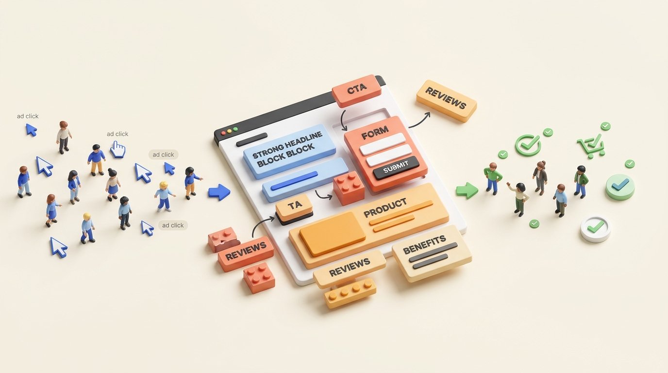
Paid traffic is expensive enough without wasting it on a page that makes visitors think too hard. A strong landing page takes the intent created by the ad and turns it into a clear path toward an enquiry, booking or sale.
Start With the Ad, Not the Page
A landing page should not be designed as an isolated piece of the website.
It is the next step in the same conversation that started inside the ad. The headline, offer and user expectation should therefore feel connected from the first second.
If an advertisement promises a specific service or result, the landing page should confirm that promise immediately rather than forcing the visitor to search for it again.
Build the Page Around One Primary Action
Many landing pages lose conversions because they try to serve too many purposes at the same time.
A paid campaign usually works better when the visitor understands exactly what the business wants them to do next.
Your Headline Has One Important Job
Visitors should not need to decode what the page is about.
A useful headline makes the offer clear quickly and connects naturally with the advertisement that brought the visitor there.
Clever wording can be useful for branding, but clarity usually matters more when someone has arrived from paid search or another high-intent campaign.
Every Section Should Make the Next Step Easier
Good landing pages are not simply collections of attractive blocks.
The headline confirms relevance. The copy explains the benefit. Trust elements reduce uncertainty. The CTA gives the visitor a clear next action.
When each section has a purpose, the page becomes a continuous conversion journey rather than a brochure placed after an advertisement.
The Core Components of a High-Converting Landing Page
Ask for Less Information When You Can
Forms are one of the most common sources of friction on landing pages.
Every additional field asks the visitor to invest more effort and share more information before they have received anything in return.
That does not mean every form should contain only a name and phone number. Some businesses need additional information to qualify enquiries.
The goal is to collect what is genuinely useful without turning the form into an unnecessary obstacle.
Ask for information because the sales process needs it — not simply because the form builder makes another field easy to add.
Trust Needs to Appear Before the Visitor Hesitates
A landing page can have a strong offer and still fail if the visitor is not confident enough to contact the company.
Reviews, clear business information, recognisable clients, previous work or transparent explanations of what happens next can all reduce uncertainty.
The right trust signal depends on the business. What matters is giving the visitor evidence at the moment they need reassurance.
Design Should Support the Offer
Visual design affects how quickly people understand the page.
Strong hierarchy, readable typography, enough whitespace and clear contrast can direct attention toward the important information.
Decorative complexity becomes a problem when it competes with the message or makes the CTA harder to find.
Mobile Is Part of the Conversion Strategy
Paid campaigns often generate a large share of their traffic on mobile devices.
A page that looks good on desktop can still lose leads if buttons become difficult to tap, text becomes too small, forms feel uncomfortable or important content shifts too far down the screen.
Mobile should be treated as a primary landing-page experience rather than a compressed version of the desktop design.
Page Speed Still Matters
Every second spent waiting is an opportunity for a paid visitor to leave before seeing the offer.
Heavy images, unnecessary scripts and overly complex effects can make an attractive page commercially weaker.
A conversion-focused page should feel fast as well as look polished.
Test the Parts That Can Change Behaviour
Landing-page optimization should focus on meaningful differences rather than changing random colors simply to say that a test was performed.
Do Not Optimize for Form Submissions Alone
It is possible to increase conversion rate while reducing lead quality.
An extremely easy form can generate more enquiries, but those enquiries may include people who are not genuinely interested or do not fit the service.
Connect landing-page performance with the sales process whenever possible.
The stronger goal is more qualified customers from the paid traffic you already spend money to acquire.
Measure the Whole Journey
Conversion rate is important, but it should not exist in isolation.
Track cost per lead, qualified lead rate, sales conversion and customer acquisition cost where the data is available.
That tells you whether the page is creating real business value rather than simply producing more form completions.
A Better Landing Page Can Make the Same Advertising Budget Work Harder
Bamboo helps businesses connect paid traffic, landing-page experience and lead generation around the same objective — turning more relevant visitors into qualified enquiries and customers.
Improve Lead GenerationFinal Thought
High-converting landing pages are not built by adding every possible element.
They are built by understanding what the visitor expects, removing unnecessary friction and giving each part of the page a clear role.
Paid traffic gives you the opportunity. The landing page determines how effectively that opportunity becomes a customer.